1st Quarter 2021
Capital Market Assumptions1
Every year we make it a priority to review the JPMorgan Capital Market Assumptions and use it as a reference point in helping us formulate asset allocation decisions. Capital Market Assumptions (CMA) are meant to be used for long-term guidance for asset class returns, and the shorter you make the time horizon the wider the confidence interval. Over periods of 10-years and more, they are very effective if they follow a sound methodology, and JPMorgan is very transparent with their process so you can see how they arrived at their assumptions. BlackRock also makes their capital market assumptions available and is the closest to JPMorgan in robustness.
The main reason we still use JPMorgan, is they provide the correlation matrix along with the volatility and return projections, which allows us to construct hypothetical portfolios using an optimizer with these as inputs. BlackRock provides everything but the correlation matrix, so it is still useful to compare the returns and dig into the differences.
To kick off the year, I am going to provide an analysis of the capital market assumptions by putting them to use constructing a variety of portfolios utilizing an optimization algorithm that we use to create our in-house portfolios within IFP Asset Management. This is more a thought exercise than anything else, and the resulting portfolios are likely unfeasible to use with actual clients. You will see what I mean as I go through my analysis. I provide the websites for both JPMorgan and Blackrock’s capital market assumptions at the end of this article.
Synopsis
One thing is apparent when going through the assumptions this year: it is going to be difficult to get yield and returns close to long-term averages for most investors without taking on additional risk over the next decade.
For the analysis presented below, I have excluded “inflation” and “cash” from JPMorgan’s original assumptions so we can focus on the rest of the data. This leaves us with a total of 55 asset classes, spanning the globe and includes fixed income, equities, and alternative assets.
JPMorgan states that the forecasts are meant to be over a 10-to-15-year time horizon, so all of the assumptions below are meant to be annual returns ending 2031 to 2036.
The top ten asset classes sorted by arithmetic return
| Compound Return | Arithmetic Return | Volatility | |
| Chinese Domestic Equity | 7.5000% | 11.4273% | 30.3936% |
| U.S. Value-Added Real Estate | 8.1000% | 9.4785% | 17.5395% |
| Hong Kong Equity | 7.6000% | 9.4360% | 20.3024% |
| Private Equity | 7.8000% | 9.3603% | 18.6738% |
| Emerging Markets Equity | 7.2000% | 9.1909% | 21.1417% |
| AC Asia ex-Japan Equity | 7.1000% | 9.0001% | 20.6231% |
| UK Large Cap | 7.5000% | 8.8345% | 17.2018% |
| Euro Area Large Cap | 6.6000% | 8.6513% | 21.4175% |
| Global Core Transport | 7.6000% | 8.4758% | 13.8686% |
| EAFE Equity | 6.5000% | 7.8037% | 16.9193% |
The top ten asset classes sorted by compound return
| Compound Return | Arithmetic Return | Volatility | |
| U.S. Value-Added Real Estate | 8.1000% | 9.4785% | 17.5395% |
| Private Equity | 7.8000% | 9.3603% | 18.6738% |
| Hong Kong Equity | 7.6000% | 9.4360% | 20.3024% |
| Global Core Transport | 7.6000% | 8.4758% | 13.8686% |
| Chinese Domestic Equity | 7.5000% | 11.4273% | 30.3936% |
| UK Large Cap | 7.5000% | 8.8345% | 17.2018% |
| Emerging Markets Equity | 7.2000% | 9.1909% | 21.1417% |
| AC Asia ex-Japan Equity | 7.1000% | 9.0001% | 20.6231% |
| Direct Lending | 6.8000% | 7.6665% | 13.7428% |
| Euro Area Large Cap | 6.6000% | 8.6513% | 21.4175% |
Compound return accounts for the volatility of the returns from year to year and will penalize asset classes that have higher volatility. You can see that with Chinese Domestic Equity, it ranks first by arithmetic return, but fifth by compound return. You can see the effect volatility has on your returns over 10-years (shaves off almost 4%!).
For comparison, BlackRock has a slightly different view, but mainly for US Private Equity, the rest lines up for the most part. The difference for private equity is large and is worth exploring in the future.
| Asset | Compound Return | Volatility |
| U.S. private equity (buyout) | 16.6% | 32.0% |
| Global direct lending | 8.0% | 15.0% |
| Europe large cap equities | 7.0% | 18.4% |
| Global ex-U.S. large cap equities | 6.8% | 16.4% |
| Global infrastructure equity | 6.7% | 18.8% |
| China-Broad market equities | 6.6% | 27.3% |
| Emerging large cap equities | 6.4% | 21.0% |
| China A shares | 6.4% | 31.1% |
| U.S. core real estate | 6.1% | 12.1% |
| Real estate mezzanine debt | 5.7% | 10.4% |
Sharpe Ratios
Using the expected arithmetic return for intermediate treasuries, I can calculate an expected Sharpe Ratio for each asset class by using the following formula:
(Arithmetic Return of Asset Class – Arithmetic Return Intermediate Treasuries) / Volatility (Standard Deviation) of Asset Class Returns
We can use this approximation of risk-adjusted return to see where the best trade-offs may be for the next decade.
Top 20 By Sharpe Ratio
| Compound Return | Arithmetic Return | Volatility | Sharpe Ratio | |
| Global Core Transport | 7.6000% | 8.4758% | 13.8686% | 0.50 |
| U.S. Leveraged Loans | 5.1000% | 5.3955% | 7.9084% | 0.49 |
| Global Core Infrastructure | 6.1000% | 6.6423% | 10.7963% | 0.47 |
| Emerging Markets Sovereign Debt | 5.2000% | 5.5668% | 8.8232% | 0.46 |
| U.S. Value-Added Real Estate | 8.1000% | 9.4785% | 17.5395% | 0.45 |
| U.S. Core Real Estate | 5.9000% | 6.4578% | 10.9409% | 0.45 |
| Direct Lending | 6.8000% | 7.6665% | 13.7428% | 0.45 |
| Asia Pacific Core Real Estate | 6.6000% | 7.3977% | 13.1629% | 0.45 |
| U.S. Muni High Yield | 4.6000% | 4.8797% | 7.6753% | 0.44 |
| European ex-UK Core Real Estate | 6.4000% | 7.1920% | 13.1034% | 0.43 |
| U.S. High Yield Bonds | 4.8000% | 5.1285% | 8.3308% | 0.43 |
| UK Large Cap | 7.5000% | 8.8345% | 17.2018% | 0.42 |
| Private Equity | 7.8000% | 9.3603% | 18.6738% | 0.42 |
| Emerging Markets Corporate Bonds | 4.7000% | 5.0441% | 8.5230% | 0.41 |
| Japanese Equity | 6.5000% | 7.4997% | 14.7639% | 0.40 |
| U.S. REITs | 6.5000% | 7.5777% | 15.3430% | 0.39 |
| Hong Kong Equity | 7.6000% | 9.4360% | 20.3024% | 0.39 |
| U.S. Securitized | 2.4000% | 2.4274% | 2.3686% | 0.37 |
| EAFE Equity | 6.5000% | 7.8037% | 16.9193% | 0.37 |
| Emerging Markets Equity | 7.2000% | 9.1909% | 21.1417% | 0.36 |
It is interesting to see how leadership changes once you account for risk. To give you more perspective, here is the same data, but with ranks instead of actual values.
| Compound Return 1 = best | Arithmetic Return 1 = best | Volatility 1 = worst | Sharpe Ratio 1= best | |
| Global Core Transport | 3 | 9 | 21 | 1 |
| U.S. Leveraged Loans | 23 | 28 | 40 | 2 |
| Global Core Infrastructure | 17 | 17 | 32 | 3 |
| Emerging Markets Sovereign Debt | 21 | 26 | 36 | 4 |
| U.S. Value-Added Real Estate | 1 | 2 | 8 | 5 |
| U.S. Core Real Estate | 18 | 20 | 31 | 6 |
| Direct Lending | 9 | 11 | 23 | 7 |
| Asia Pacific Core Real Estate | 10 | 15 | 25 | 8 |
| U.S. Muni High Yield | 29 | 34 | 43 | 9 |
| European ex-UK Core Real Estate | 15 | 16 | 26 | 10 |
| U.S. High Yield Bonds | 26 | 31 | 39 | 11 |
| UK Large Cap | 5 | 7 | 9 | 12 |
| Private Equity | 2 | 4 | 7 | 13 |
| Emerging Markets Corporate Bonds | 28 | 33 | 38 | 14 |
| Japanese Equity | 12 | 13 | 20 | 15 |
| U.S. REITs | 12 | 12 | 16 | 16 |
| Hong Kong Equity | 3 | 3 | 5 | 17 |
| U.S. Securitized | 41 | 44 | 54 | 18 |
| EAFE Equity | 12 | 10 | 12 | 19 |
Now, let us pull all this data together along with the correlation matrix and build some portfolios to see what it looks like.
Portfolio Construction
In the following examples, I am going to construct a total of 9 different portfolios, laid out with descriptions below.
- Max Sharpe: portfolio with the best Sharpe Ratio, also known as the “tangency portfolio”
- Min Vol: portfolio with the lowest volatility
- Target Return 4, 5, 6, 7, 8, 9 and 10: minimizes risk for a given target return
For the first set, I am going to allow the portfolio weights to flow freely between 0 and 1% (min and max weight constraint for each asset class in the optimization) so we can see the extremes of the results.
Stats
| Max Sharpe | Min Vol | Target Return 4% | Target Return 5% | Target Return 6% | Target Return 7% | Target Return 8% | Target Return 9% | Target Return 10% | |
| Expected annual return | 5.2% | 2.0% | 4.0% | 5.0% | 6.0% | 7.0% | 8.0% | 9.0% | 10.0% |
| Annual volatility | 4.3% | 1.4% | 2.9% | 4.1% | 5.5% | 7.0% | 8.7% | 10.8% | 15.2% |
| Sharpe Ratio | 0.73 | 0.01 | 0.70 | 0.73 | 0.73 | 0.72 | 0.69 | 0.65 | 0.53 |
Allocations
| Max Sharpe | Min Vol | Target Return 4% | Target Return 5% | Target Return 6% | Target Return 7% | Target Return 8% | Target Return 9% | Target Return 10% | |
| U.S. Intermediate Treasuries | 0.00% | 0.00% | 6.37% | 0.00% | 0.00% | 0.00% | 0.00% | 0.00% | 0.00% |
| U.S. Long Treasuries | 3.32% | 0.00% | 0.00% | 2.16% | 8.58% | 9.62% | 0.00% | 0.00% | 0.00% |
| U.S. Securitized | 42.68% | 0.00% | 61.89% | 47.68% | 19.87% | 0.00% | 0.00% | 0.00% | 0.00% |
| U.S. Short Duration Government_Credit | 0.00% | 86.84% | 0.00% | 0.00% | 0.00% | 0.00% | 0.00% | 0.00% | 0.00% |
| World ex-U.S. Government Bonds hedged | 0.00% | 6.37% | 0.00% | 0.00% | 0.00% | 0.00% | 0.00% | 0.00% | 0.00% |
| U.S. Muni 1-15 Yr Blend | 0.00% | 0.31% | 0.00% | 0.00% | 0.00% | 0.00% | 0.00% | 0.00% | 0.00% |
| U.S. Muni High Yield | 8.14% | 0.00% | 3.40% | 7.65% | 10.41% | 12.06% | 8.12% | 0.00% | 0.00% |
| Japanese Equity | 7.18% | 0.00% | 4.01% | 6.66% | 9.53% | 12.29% | 13.07% | 5.16% | 0.00% |
| Hong Kong Equity | 0.00% | 0.00% | 0.00% | 0.00% | 0.00% | 0.00% | 3.71% | 16.09% | 0.00% |
| Chinese Domestic Equity | 4.42% | 0.00% | 2.26% | 4.10% | 5.91% | 8.03% | 10.25% | 14.65% | 38.17% |
| U.S. Core Real Estate | 0.00% | 3.34% | 0.00% | 0.00% | 0.00% | 0.00% | 0.00% | 0.00% | 0.00% |
| U.S. Value-Added Real Estate | 0.00% | 0.00% | 0.00% | 0.00% | 0.00% | 0.00% | 0.00% | 4.20% | 39.66% |
| European ex-UK Core Real Estate | 0.00% | 1.07% | 0.00% | 0.00% | 0.00% | 0.00% | 0.00% | 0.00% | 0.00% |
| Global Core Infrastructure | 8.75% | 0.00% | 5.18% | 8.09% | 11.77% | 14.07% | 11.16% | 0.00% | 0.00% |
| Global Core Transport | 17.97% | 0.00% | 10.63% | 16.85% | 23.07% | 30.17% | 40.51% | 53.19% | 22.18% |
| Diversified Hedge Funds | 0.00% | 0.27% | 0.00% | 0.00% | 0.00% | 0.00% | 0.00% | 0.00% | 0.00% |
| Macro Hedge Funds | 0.00% | 0.00% | 0.96% | 0.00% | 0.00% | 0.00% | 0.00% | 0.00% | 0.00% |
| Direct Lending | 7.13% | 1.81% | 5.29% | 6.57% | 9.72% | 11.58% | 10.73% | 6.72% | 0.00% |
| Gold | 0.41% | 0.00% | 0.00% | 0.25% | 1.15% | 2.18% | 2.45% | 0.00% | 0.00% |
| Total | 100% | 100% | 100% | 100% | 100% | 100% | 100% | 100% | 100% |
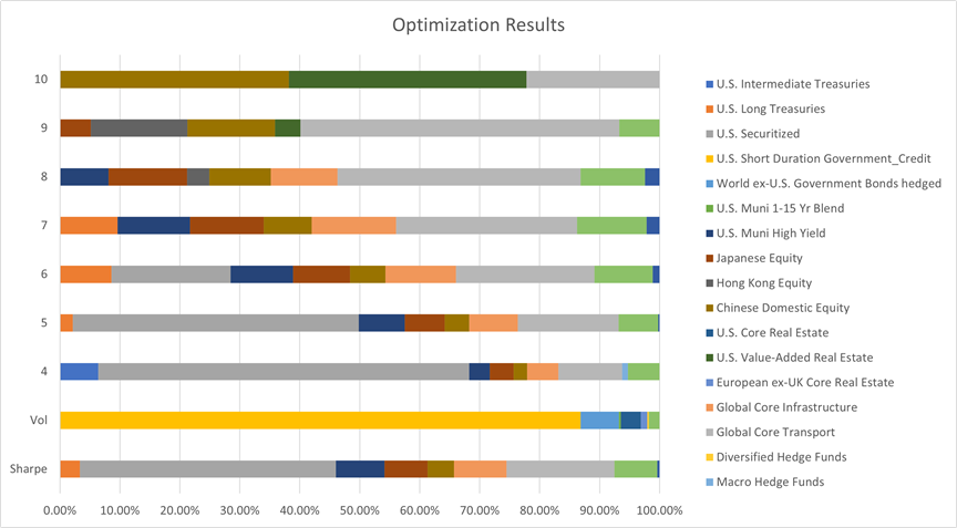
For a final step, I am going to re-run the optimizer, but constrain each asset class to a maximum of 30% of the portfolio.
Stats
| Max Sharpe | Min Vol | Target Return 4% | Target Return 5% | Target Return 6% | Target Return 7% | Target Return 8% | Target Return 9% | Target Return 10% | |
| Expected annual return | 5.6% | 2.2% | 4.0% | 5.0% | 6.0% | 7.0% | 8.0% | 9.0% | 10.0% |
| Annual volatility | 4.9% | 1.6% | 2.9% | 4.1% | 5.5% | 7.0% | 8.8% | 11.2% | 16.5% |
| Sharpe Ratio | 0.73 | 0.15 | 0.69 | 0.73 | 0.73 | 0.72 | 0.68 | 0.62 | 0.49 |
Allocations
| Max Sharpe | Min Vol | Target Return 4% | Target Return 5% | Target Return 6% | Target Return 7% | Target Return 8% | Target Return 9% | Target Return 10% | |
| U.S. Intermediate Treasuries | 0.0% | 30.0% | 30.0% | 12.5% | 0.0% | 0.0% | 0.0% | 0.0% | 0.0% |
| U.S. Long Treasuries | 7.0% | 0.0% | 0.0% | 4.1% | 8.6% | 9.6% | 0.0% | 0.0% | 0.0% |
| U.S. Securitized | 30.0% | 4.8% | 30.0% | 30.0% | 19.9% | 0.0% | 0.0% | 0.0% | 0.0% |
| U.S. Short Duration Government_Credit | 0.0% | 30.0% | 3.2% | 0.0% | 0.0% | 0.0% | 0.0% | 0.0% | 0.0% |
| U.S. Leveraged Loans | 0.0% | 2.6% | 1.0% | 0.0% | 0.0% | 0.0% | 0.0% | 0.0% | 0.0% |
| World ex-U.S. Government Bonds hedged | 0.0% | 17.8% | 0.0% | 0.0% | 0.0% | 0.0% | 0.0% | 0.0% | 0.0% |
| U.S. Muni 1-15 Yr Blend | 0.0% | 3.9% | 0.0% | 0.0% | 0.0% | 0.0% | 0.0% | 0.0% | 0.0% |
| U.S. Muni High Yield | 9.5% | 0.0% | 5.3% | 8.6% | 10.4% | 12.1% | 6.4% | 0.0% | 0.0% |
| Japanese Equity | 8.3% | 0.0% | 4.9% | 7.1% | 9.5% | 12.3% | 13.4% | 6.8% | 0.0% |
| Hong Kong Equity | 0.0% | 0.0% | 0.0% | 0.0% | 0.0% | 0.0% | 1.1% | 10.6% | 19.4% |
| Chinese Domestic Equity | 5.1% | 0.0% | 2.6% | 4.2% | 5.9% | 8.0% | 11.7% | 16.2% | 30.0% |
| Private Equity | 0.0% | 0.0% | 0.0% | 0.0% | 0.0% | 0.0% | 0.0% | 0.0% | 17.1% |
| U.S. Core Real Estate | 0.0% | 2.8% | 0.0% | 0.0% | 0.0% | 0.0% | 0.0% | 0.0% | 0.0% |
| U.S. Value-Added Real Estate | 0.0% | 0.0% | 0.0% | 0.0% | 0.0% | 0.0% | 3.5% | 19.8% | 30.0% |
| European ex-UK Core Real Estate | 0.0% | 4.0% | 0.0% | 0.0% | 0.0% | 0.0% | 0.0% | 0.0% | 0.0% |
| U.S. REITs | 0.0% | 0.0% | 0.0% | 0.0% | 0.0% | 0.0% | 0.5% | 0.0% | 0.0% |
| Global Core Infrastructure | 10.5% | 0.0% | 5.8% | 9.0% | 11.8% | 14.2% | 17.7% | 5.4% | 0.0% |
| Global Core Transport | 20.3% | 0.0% | 10.8% | 16.7% | 23.1% | 30.0% | 30.0% | 30.0% | 3.5% |
| Diversified Hedge Funds | 0.0% | 2.2% | 0.0% | 0.0% | 0.0% | 0.0% | 0.0% | 0.0% | 0.0% |
| Macro Hedge Funds | 0.0% | 0.0% | 0.2% | 0.0% | 0.0% | 0.0% | 0.0% | 0.0% | 0.0% |
| Direct Lending | 8.6% | 1.9% | 6.2% | 7.8% | 9.7% | 11.6% | 14.4% | 11.2% | 0.0% |
| Gold | 0.7% | 0.0% | 0.0% | 0.1% | 1.2% | 2.2% | 1.4% | 0.0% | 0.0% |
| Total | 100% | 100% | 100% | 100% | 100% | 100% | 100% | 100% | 100% |
Summary of Findings
- Consequently, all the allocations presented above carry enormous reputational and career risk. They may work out over ten years, but in between, you may find yourself losing investors by the truck load if things do not go your way for a year or two!
- It will be more difficult than it has been over the last century to get to the same average returns and may require undertaking new risks as an investor (more on this in the pages that follow).
- Understanding these risks before investing will be crucial, especially if investors are to remain committed to their asset allocation plan. Avoid finding out they are not comfortable with the risks they assumed after the fact.
- Investors will need to think about yield and sources of distributions differently and may need to use total returns rather than income generated by investments only.
- Even though yields are low right now, they could certainly increase over the coming years making fixed income more attractive as a source of returns and distributions.
- Not all the asset classes used in this illustration are going to be investable for some, and caution should be applied with trying to reach into those asset classes by paying exorbitant fees. It will most likely be better to avoid asset classes meant for high net-worth investors than losing your capital or paying away the benefit of the asset class in fees.
- The returns in the capital market assumptions above are meant to be long-term, and in the short-term anything can happen. With the Fed holding steady with ZIRP (0% interest rate policy), we may have a year or two of above average returns, followed by several that are below average!
- The best path forward is to start incorporating some of the above concepts into portfolios in small doses and setting expectations with clients. Planning to save more and spend less has never ended badly and is especially important at this juncture.
The optimization results did not include any US Equity allocations, and none were in any of the top 10 rankings. I think this is the part that most investors will have a hard time with, since that has been the only place to be over the last 10 years. This is also why the returns are suppressed relative to the rest of the world when looking at traditional equity.
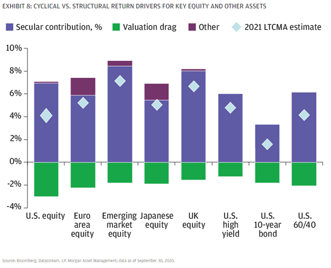
JPMorgan provides more details behind low US Equity returns in their forecast and provide elevated valuations as the reason, citing a 150 bps (1.5%) detraction from forward returns.
The same holds true for the US 10-year bond, and when combined to form a 60/40 portfolio the results are less than exciting.
As we demonstrated earlier in the optimization results, investors can still earn above average returns by venturing outside of the traditional public markets.
Normally when the US begins recovering from a recession, valuations are typically much lower than they were before the recession began. This time around, ultra-easy monetary policy combined with other forms of stimulus have boosted equity valuations much earlier in the cycle.
JPMorgan provides a nice graphic showing the efficient frontiers from 2008, 2020, and 2021 which helps bring everything we have talked about so far in this letter together.
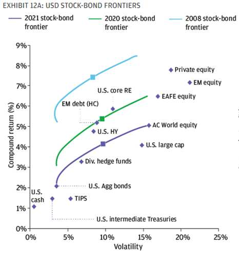
In 2008, the efficient frontier was in a much more attractive spot and looks a lot like the charts they show when you are learning about modern portfolio theory. However, as of last year, equity valuations were already elevated but the Fed was in the process of tightening monetary policy, so interest rates were quite a bit higher.
The most liquid markets around the globe benefited from policymaker intervention, and while they did a great job supporting the financial markets during the pandemic, it has been at the expense of future returns.
As we illustrated previously, private markets and real assets are still projected to deliver attractive returns if investors can deal with the illiquidity and other peculiarities with investing in those asset classes. These are the two asset classes which have been least impacted by pandemic driven policies.
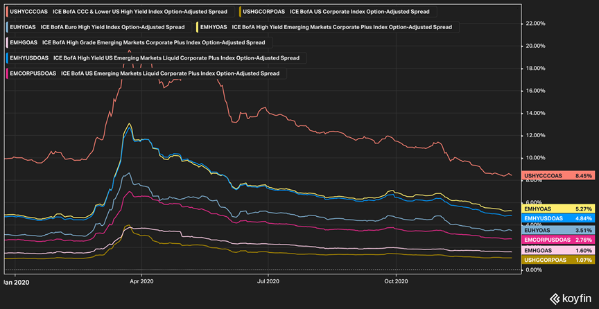
Finally, comparing the major US Asset Class returns to last year’s (left side of the chart below) illustrates the impact higher valuations and zero interest rate policy have had on forward returns. What is interesting is that high yield bonds are still relatively close to where they were in 2020.
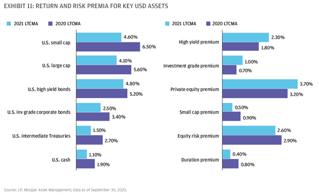
There are still a few pockets of the US market still recovering from the recession. The high yield premium and investment grade premium are higher than they were last year (these are the spreads added on to risk-free rates to arrive at the total yield for both respectively), but since risk-free rates dropped more than the premium’s increased, it results in a lower total return projection.
On an absolute basis, the US Public Markets are slim pickings right now, but on a relative basis, investors are still being compensated with higher returns for investing in junk bonds. It also shows that the market is pricing in some level of defaults in the wake of the pandemic, so it may make sense to stay active with high yield exposure.
Be Careful When Reaching for Yield
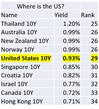
Global government bond yields2
I was interested in the countries across the globe exhibiting the highest 10-year yields. Like the results outlined earlier, the only way to get yield today is to take risks most investors are not equipped to handle.
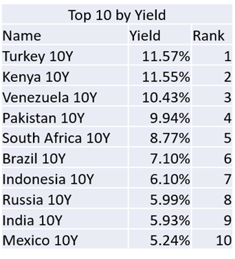
The top 10 by yield contains countries that are mostly Emerging Markets and have significant political, currency or other risks that should only be taken in small doses, if at all.
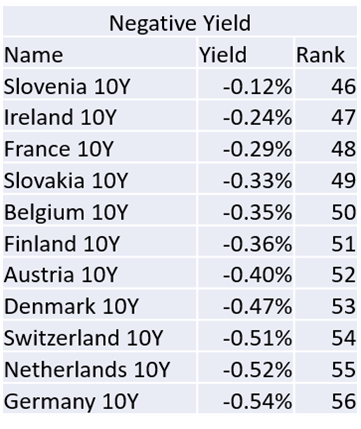
11 countries (out of the 56 I pulled data on here) have 10-year government bonds that have negative yields now. Unless you live in those countries, it clearly makes no sense to leverage them as part of a portfolio.
It is very hard in this environment to justify an advisory fee for investing in any developed market government bond. It is impossible to beat inflation with government bonds unless you are willing to take on new risks (country specific risk/currency risk) which is consistent with our optimization results from earlier.
Corporate Credit – Option Adjusted Spreads2
The Federal Reserve has successfully pushed credit spreads back down to levels lower than they were pre-crisis. Option adjusted spreads (OAS) account for the Fed’s zero interest rate policy, since they are spreads that are added to risk-free rates/treasuries. Are defaults less likely now than they were at the start of the year?
Expanding the Search3
Using a list of ETFs as proxies for (investible) income generating asset classes globally, what does the landscape look like?
| Broad Category | Category Name | Dividend Yield |
| Equity | Energy Limited Partnership | 11.6648% |
| Fixed Income | Business Development Companies (BDC) | 9.8900% |
| Equity | Real Estate (Mortgage REITs) | 7.9379% |
| Allocation | Closed End Fund Composite | 7.6196% |
| Equity | Equity Energy | 5.2514% |
| Fixed Income | High Yield Bond | 4.8946% |
| Fixed Income | Emerging-Markets Local-Currency Bond | 4.8881% |
| Fixed Income | Preferred Stock | 4.8331% |
| Equity | World Small/Mid Stock | 4.6349% |
| Equity | Real Estate | 4.0465% |
Out of 42 asset classes yielding above 1%, the top ten ranked by yield are shown above. Do you think investors can stomach the risk these investments may bring to their portfolio?
Risk-Adjusted Yield (Simple calculation dividing the yield by annualized standard deviation)
What about if we adjust the yields for volatility, so we can compare the yields more easily and spot where investors are (in)adequately compensated for risk through higher yields?
| Broad Category | Category Name | Dividend Yield | Annualized Standard Deviation | Risk-Adjusted Yield | Yield Rank | Vol Rank | Yield / Vol Rank |
| Equity | Energy Limited Partnership | 11.6648% | 78.1338% | 0.149 | 1 | 2 | 17 |
| Fixed Income | Business Development Companies (BDC) | 9.8900% | 47.7324% | 0.207 | 2 | 6 | 10 |
| Equity | Real Estate (Mortgage REITs) | 7.9379% | 67.9126% | 0.117 | 3 | 3 | 20 |
| Allocation | Closed End Fund Composite | 7.6196% | 32.4096% | 0.235 | 4 | 17 | 9 |
| Equity | Equity Energy | 5.2514% | 63.8459% | 0.082 | 5 | 4 | 27 |
| Fixed Income | High Yield Bond | 4.8946% | 17.7787% | 0.275 | 6 | 28 | 6 |
| Fixed Income | Emerging-Markets Local-Currency Bond | 4.8881% | 19.0316% | 0.257 | 7 | 27 | 7 |
| Fixed Income | Preferred Stock | 4.8331% | 25.2040% | 0.192 | 8 | 25 | 12 |
| Equity | World Small/Mid Stock | 4.6349% | 43.8158% | 0.106 | 9 | 8 | 25 |
| Equity | Real Estate | 4.0465% | 36.0477% | 0.112 | 10 | 14 | 21 |
• The first 4 asset classes also carry the highest risk (by standard deviation).
• Income investors need to think in “total returns”, not just yield, unless they want to assume a lot of equity risk, default risk, or illiquidity.
Two Hypothetical Portfolios3
Taking this one step further, what if we construct two hypothetical portfolios using the universe of assets from the previous example and splitting them as described below? What does that look like in terms of risk, and how did it hold up during the recession?
- Portfolio A: Top ten ranked by yield, equally weighted
- Portfolio B: Top ten ranked by risk-adjusted yield, equally weighted
| Name | Volatility | Yield |
| Portfolio A | 40.55% | 6.57% |
| Portfolio B | 11.93% | 3.80% |
| Bloomberg Barclays US Aggregate | 4.06% | 2.15% |
| S&P 500 Total Return | 30.30% | 1.53% |
Drawdowns3
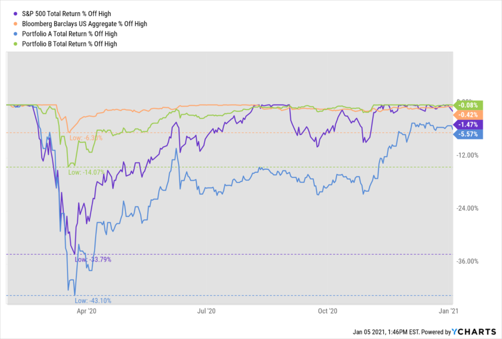
Portfolio B (10 highest risk-adjusted yields) fared much better, but still more than double that of the Aggregate Bond Index. The portfolio recovered from the drawdown within six months.
Income investors need to pay attention to risk, especially if you are taking regular withdrawals from your portfolio. Comparing yields by adjusting for volatility seems to help with capital preservation, although the yield is not as enticing, it is still almost double what you can get with traditional bonds.
Conclusion
- Think creatively when designing portfolios for investors making regular distributions from their investment accounts
- Pay attention to the risk that comes with any yields that are above risk-free rates for a comparable maturity. If you cannot figure out the source of risk or why the yield is elevated, you are probably better off avoiding the investment.
- Use a total return approach for portfolio construction, yield alone will not do it without substantial risk of loss and impairment of capital.
- Would your clients rather have equity risk (volatility) or default risk (loss of principal)?
Sources
1 BlackRock’s capital market assumptions can be found here: https://www.blackrock.com/institutions/en-zz/insights/charts/capital-market-assumptions
1 JPMorgan’s Capital Market Assumptions can be found here: https://am.jpmorgan.com/us/en/asset-management/institutional/insights/portfolio-insights/ltcma/
2 Koyfin
3 YCharts
Disclosures
The views expressed are that of IFP and are for informational purposes only and in no event should be construed as an offer to buy or sell securities. Opinions expressed are subject to change without notice and do not take into account the particular investment objectives, financial situation, or needs of individual investors. Past performance is no guarantee of future returns. Investors cannot invest directly in an index.
The information given herein is taken from sources that IFP Advisors, LLC, dba Independent Financial Partners (IFP), IFP Securities LLC, dba Independent Financial Partners (IFP) believe to be reliable but it is not guaranteed by us as to accuracy or completeness. This is for informational purposes only and in no event should be construed as an offer to sell or solicitation of an offer to buy any securities or products.
Securities offered through IFP Securities, LLC, dba Independent Financial Partners (IFP), member FINRA/SIPC. Investment advice offered through IFP Advisors, LLC, dba Independent Financial Partners (IFP), a Registered Investment Adviser.