Given where we are in both the economy and stock market this year, I think it would be helpful to revisit some of the same data points and charts we looked at last quarter and see how things have changed.
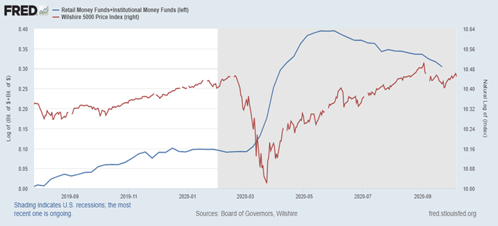
Record levels of money market assets held by investors and institutions
When we last examined this chart, the record levels of cash sitting on the sidelines had just peaked (which we now know to be true – for the time being, at least). We had discussed the possibility of this providing a nice tail wind for the performance of the stock market going forward.
It now appears that this may be coming to fruition.
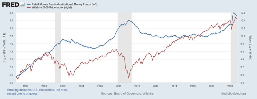
Solely looking at the last year in this chart helps us see what has transpired in greater detail. The scaling makes it hard to see, but money market fund asset levels peaked on May 25th at $4,419 billion and as of September 21st stood at $4,041 billion. So roughly $400 billion has left and been invested elsewhere, which represents about 1/3 of the increase since the recession officially began. My guess would be that the remainder is deployed after the election and the 2 weeks leading up to it (more on that later), which should be positive for risky assets.
What about credit risk?
Last quarter, the spreads for high yield bonds were around 6.4 percent and trending downwards.
We wanted to keep an eye on the continued down trend of the spread, as this means investors are less nervous about widespread defaults amongst lower credit quality bond issuers.
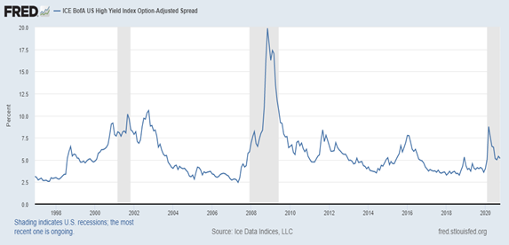
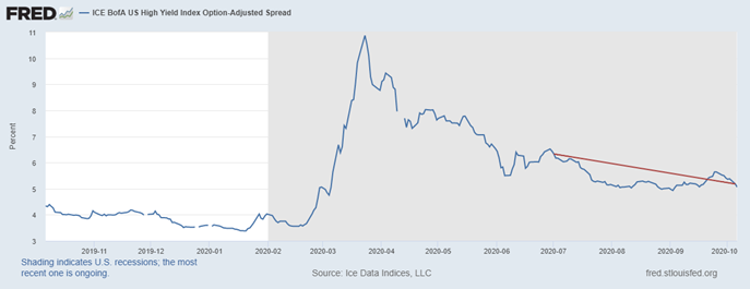
The spread sits just above 5% now, which is indicative of a recovery in the economy. As the economy continues to rebound, the spread should ultimately land back around 4%, so we are making good progress and are a long way from the peak of 10.87 on March 23rd.
Unemployment Rate and Non-Farm Payrolls
The unemployment rate also shows a similar trend in the right direction, which should continue to improve.

When we initially looked at the unemployment statistics back in early April to assess the aftermath of the US economy shutdown, a lot of the layoffs were in industries that I would consider “quick-to-fire/quick-to-hire”. Meaning that the process of hiring or firing employees is a much quicker process than is typical.
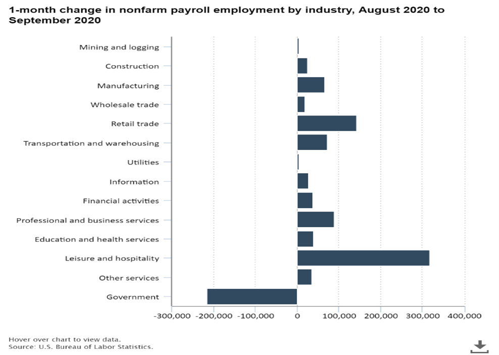
During the month of August, most of the hiring came from the industries I described above and continues to trend in the right direction.
[Y]earnings Season
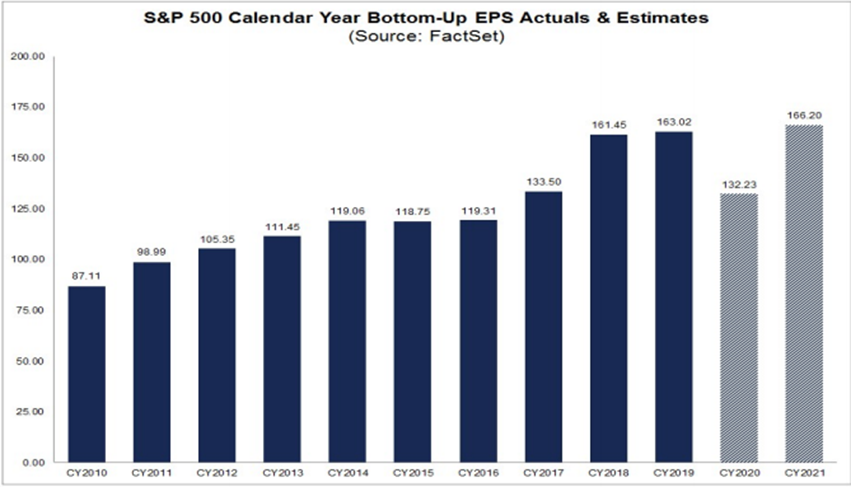
When we last looked at this chart from FactSet, CY2020 was forecasted to be at $126.79 and CY2021 was projected to be at $163.17. Since then, analysts have revised estimates up to $132.23 for CY2020 (a 4.3% increase) and $166.20 for CY2021 (a 1.85% increase and now puts us ahead of CY2019 EPS).
Forward P/E Ratios are calculated by taking a stock’s current price and dividing it by the next 12-months of estimated earnings. While the chart above may appear concerning, it is rather typical given where we are in the market. Aswath Damodaran, a Professor of Finance at the Stern School of Business at NYU, published a diagram called “Market Crises and Pricing.” Within the diagram, he lays out 3 phases that are typical within the environment we find ourselves in today. I believe it to be applicable to the chart below, and the charts that follow.
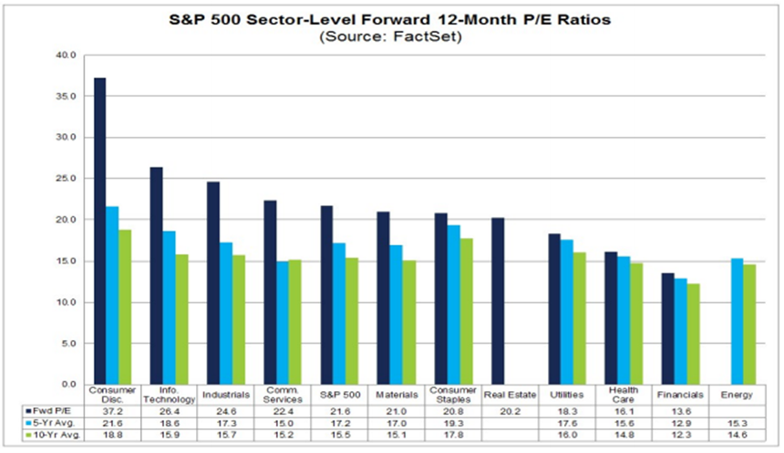
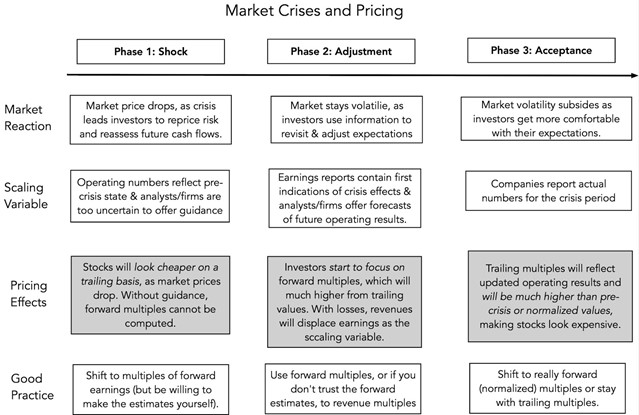
I am of the opinion that we are towards the end of Phase 2 (adjustment). Human behavior swings wildly from overly optimistic to overly pessimistic before adjusting to something in between, which you can see in the numbers I am about to walk you through.
Looking at the Forward P/E broken out by sector, you can see that every sector in the S&P 500 looks expensive when compared to a 5 and 10-year Forward average historical P/E ratio. Is that cause for concern and is the market really that overvalued that every sector is expensive? I do not think so.
If you refer to the figure above, Phase 2 states that it is good practice to use forward multiples, but only if you trust earnings estimates. I would argue that at this point, analysts are still adjusting from a state of extreme pessimism on the ability of companies to generate earnings in the current environment.
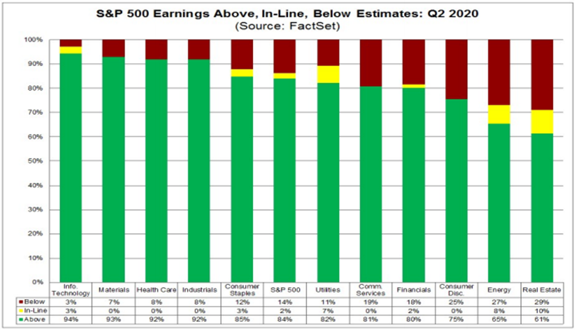
Looking at what just happened in Q2 of this year through the chart below, we can see evidence of what I just described:
- All sectors in the S&P 500 had greater than 60% of companies report earnings that were above analyst estimates
- 94% of companies in the Information Technology sector beat EPS estimates
- 4 of 12 sectors had more than 90% beating estimates
Overall, I think that earnings estimates are still a bit too pessimistic, which leads me to believe that we should use forward Price to Sales as a proxy for valuation, as suggested in the Market Crises and Pricing diagram.
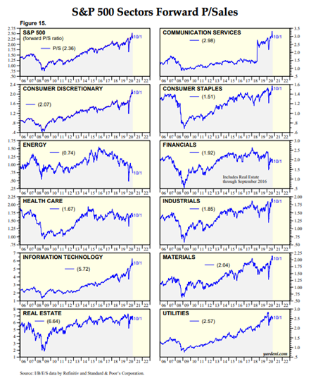
Looking at the chart to the left, we can see that based on revenues, valuations are not at the same extremes for every sector as indicated by forward P/E ratios.
Energy, Financials, Health Care, and Real Estate all appear to be somewhat reasonably valued, and the rest may be a bit rich based on today’s prices. The S&P 500 overall looks expensive based on forward Price-to-sales ratios. Before jumping to conclusions, lets dig into that a little more.
A few weeks ago, I did a deep dive into the performance of the S&P 500 and the stocks within the index. What we ultimately discovered was that the recovery in the S&P 500 price has been rather misleading as to the performance of stocks individualy. The bulk of the recovery in the index was driven by the 50 largest constituents (these stocks account for more than 50% of the index due to the way the index is constructed).
That same anomaly has occurred more broadly, and when looking at the Russell 3000 index, the results were even more disparate. The top 300 stocks have been responsible for the majority of the positive performance seen today. Year-to-date, the market has rewarded mega-cap growth stocks (some without any earnings) while leaving the rest in the dust.
To wrap this part up, I want us to look at the S&P 400 and S&P 600, (mid-cap and small-cap indices) to see if the same overvaluation is present in those baskets of securities.
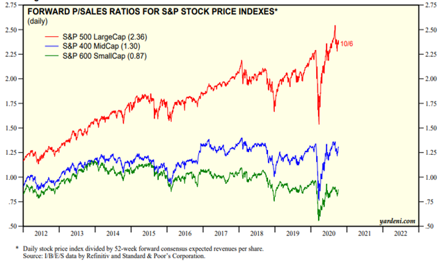
The chart on the left is worth a thousand words and paints a different picture. The conclusion I draw from this exercise can be summarized in the following bullet points:
- The top 50 stocks in the S&P 500 are expensive based on historical standards and seem to be skewing the aggregate S&P 500 valuations well above levels seen in recent history.
- Small-cap and mid-cap stocks, in aggregate, appear to be much more reasonably priced and have been largely ignored this year by investors.
- The current valuations for mega-cap stocks look a bit stretched.
All of this gives me pause, and I would think twice before putting a lot of money into the S&P 500 index at this point, but sectors within the S&P 500 and the smaller capitalization stocks may be rewarded in the future relative to the top 50 stocks in the US.
Uncertainty
My friends over at MarketPsych produce interesting data related to markets and sentiment (read more about it here: https://www.marketpsych.com/ ). They just published research that studied the level of uncertainty in the media around U.S. presidential elections from 2000 to 2020.
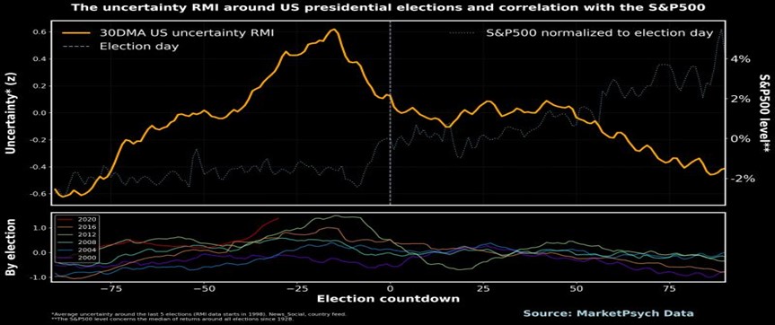
On average, U.S. media uncertainty (yellow) peaks around 20 days before the election. As uncertainty falls, the S&P 500 rallies (plotted in the light white dashed line using average pre- and post-election stock returns from 1928 to 2016). As the election approaches, the investment community and public have a reasonable forecast of the outcome. Their “uncertainty collapse” leads to a rally in U.S. shares in the 14 days prior to the event. Each election’s uncertainty is plotted separately below with 2020 as the red line – it is a consistent pattern. And based on this, we may see a rally beginning in 1-2 weeks that runs through the election.
MarketPsych
As I mentioned earlier in this letter, I believe that with the amount of cash sitting on the sidelines earning almost no interest will eventually make its way into risky assets. The improving economic backdrop, with low and stable inflation, may lead to a strong finish to the year in the market, regardless of who wins the election.
Sincerely,

The views expressed are that of IFP and are for informational purposes only and in no event should be construed as an offer to buy or sell securities. Opinions expressed are subject to change without notice and do not take into account the particular investment objectives, financial situation, or needs of individual investors. Past performance is no guarantee of future returns. Investors cannot invest directly in an index.